Why Patients Leave Clinic Websites Without Booking an Appointment
Patients find your clinic online, then leave before booking. Fix the friction in forms, doctor info, services, mobile speed, local SEO, and contact options. You will see the main reasons patients leave clinic websites without booking an appointment, how each friction point shows up, and practical fixes for forms, doctor pages, services and pricing guidance, mobile performance, local SEO, and contact options.
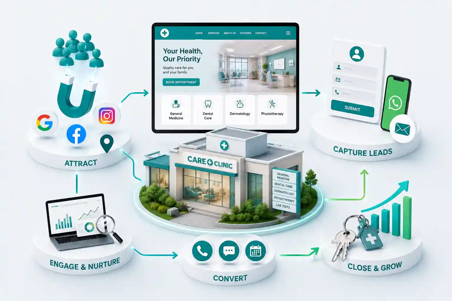
A patient searches for a clinic, opens your site, checks a doctor name, and closes the tab without booking. Front desk staff never see the almost-appointment. Ads and directory listings keep sending traffic while the website quietly leaks intent through hard forms, missing information, and unclear next steps. Online appointments are won or lost in minutes. Patients compare clinics the same way they compare any local service: clarity, trust, and ease. If booking feels risky or complicated, they call a competitor—or delay care. Fixing friction on the clinic website protects both growth and patient experience.
You will see the main reasons patients leave clinic websites without booking an appointment, how each friction point shows up, and practical fixes for forms, doctor pages, services and pricing guidance, mobile performance, local SEO, and contact options.
For clinic owners, practice managers, doctors building a digital front door, and teams improving Clinic Website Development for online appointments.
The almost-appointment: where patient intent dies
Most clinic sites measure visits, not near-misses. A near-miss is a patient who found the right specialty, believed the clinic could help, then abandoned the path before a booking confirmation. That abandonment rarely looks dramatic. It looks like a half-completed form, a doctor page with no schedule cue, a service page without an obvious Book action, or a mobile layout that hides phone and WhatsApp behind menus.
Treat the website as a digital front desk. The questions patients ask a receptionist are the same ones they ask your pages: Who will see me? What do you treat? How do I book? What will it roughly cost or include? How do I reach someone if booking fails? When answers are missing, patients leave—even if your clinical care is excellent. A calm, complete answer set turns anxious research into a completed appointment request.
Also separate emergency or walk-in guidance from routine booking. If patients with urgent symptoms should call or go elsewhere, say so early. Clear boundaries reduce abandoned forms filled by people who needed a different path, and they protect trust when the website is honest about what online booking can and cannot do.
Difficult booking forms push patients away
Long booking forms are a leading reason patients leave. Asking for insurance details, full medical history, referral documents, and multiple optional fields before a first slot is confirmed turns a simple request into homework. Keep the first step short: patient name, phone, preferred doctor or specialty, preferred date window, and a short reason for visit. Collect clinical paperwork after the appointment is held or through a secure follow-up path your team controls.
Form design matters as much as field count. Unclear labels, errors that clear entered text, and calendars that fail on mobile create silent abandonment. Show progress for multi-step flows, explain why a field is required, and confirm what happens after submit—such as a call to confirm the slot. If online booking is not available for every service, say so and offer a callback or WhatsApp path instead of a dead end. Patients forgive limited online inventory when the alternative path is obvious and staffed.
Privacy language should be short and specific. Tell patients how appointment details are used for scheduling and follow-up, and avoid forcing marketing consent into the same checkbox as booking. Confusion about data use is another quiet reason people close the tab before they finish.
Limit first-step fields to what front desk needs to hold a slot
Offer specialty or doctor selection with plain language
Preserve typed answers after validation errors
Confirm next steps and expected reply time after submit
Provide call and WhatsApp fallbacks when booking is full or offline
Missing doctor information and unclear services or pricing guidance
Patients often leave when they cannot verify who they will see. A clinic homepage with stock photography and no doctor profiles feels anonymous. Publish clear doctor pages with specialty, qualifications, languages spoken, and the conditions commonly treated. Add a direct Book with this doctor action. When multiple clinicians share a specialty, help patients choose without forcing a phone call for basic orientation.
Unclear services create the same exit. Specialty names alone are not enough if patients cannot tell whether their symptom or need fits. Use plain-language service pages that explain who the page is for, what a first visit usually includes, and when to seek urgent care elsewhere if relevant. Pricing guidance does not require a full public rate card for every procedure. Even a short note on consultation fees, what affects cost, or how estimates are shared reduces anxiety and unnecessary calls.
Information patients need before booking
Page type
Must answer
Booking support
Doctor profile
Who will I see?
Book with this doctor CTA
Service page
Do you treat my need?
Book or request callback
Visit guidance
What should I expect?
Prep tips and timing
Fees note
What will this roughly cost?
Honest next-step estimate
Contact options
How else can I reach you?
Call, WhatsApp, form
Need a clinic website that turns visits into appointments?
Discuss booking flows, doctor pages, and mobile patient paths in a consultation focused on Clinic Website Development.
Slow mobile experience loses after-hours patients
Many appointment attempts happen on phones after work. Heavy image carousels, unoptimized maps, and chat widgets can delay the booking button long enough for a patient to quit. Compress media, prioritize the booking path above decorative content, and test on common Android networks. A clinic site that looks fine on clinic Wi-Fi can still fail for a patient on a commute.
Mobile layout friction is as damaging as raw speed. Sticky bars that cover form fields, tiny tap targets on calendar days, and menus that hide Call and Book actions all increase leave rates. Keep one primary booking action visible on priority pages and place phone and WhatsApp where thumbs can reach them without hunting.
Weak local SEO and unclear contact options
Some patients never reach a bookable page because local search does not surface the clinic clearly. Inconsistent name, address, and phone details, a thin Google Business Profile, and service pages that ignore neighbourhood intent all reduce nearby appointment demand. Align website NAP details with your profile, publish accurate hours, and make sure specialty pages mention the localities you actually serve without stuffing keywords.
Unclear contact options complete the leak. Patients may want to ask a short question before booking, confirm insurance acceptance, or reach reception when online slots look full. Offer call, form, and—where appropriate—WhatsApp with expectations for reply times. If certain queries cannot be handled over chat for privacy reasons, say what channel to use instead. Ambiguity feels like avoidance and drives patients away.
Hours and holiday notices belong next to booking as well. Nothing frustrates a patient more than completing a form at midnight and discovering the clinic was closed for a festival week with no auto-reply. Publish exceptions, after-hours rules, and whether messages receive next-business-day callbacks. Predictability keeps people from assuming the clinic ignored them.
How to fix the path from visit to booked appointment
Prioritize the patient job: find the right doctor or service, trust the clinic, book a slot, or reach a human quickly. Shorten forms, complete doctor and service pages, speed up mobile templates, strengthen local listings, and clarify contact channels. Then measure booking starts, completions, calls, and no-shows—not traffic alone. Each metric points to a different friction point you can remove.
Run a monthly leave-without-booking review with front desk and marketing together. Compare which pages start bookings, which devices fail, and which messages patients leave in abandoned notes or call logs. Small copy and form changes often recover more appointments than another round of ads pointing at the same broken path.
Map the primary booking journey on a phone end to end.
Remove nonessential fields from the first booking step.
Publish doctor and service pages with clear Book actions.
Add honest visit and fee guidance where policy allows.
Align Google Business Profile details with the website.
Set reply ownership for forms, calls, and chat.
“Patients do not abandon clinics because care is unavailable—they abandon websites that make booking feel harder than it should be.”
Common reasons include long booking forms, missing doctor details, unclear services or fee guidance, slow mobile pages, weak local visibility, and contact options that are hard to find when booking fails.
Keep the first step short enough to finish on a phone: identity, contact number, specialty or doctor, preferred timing, and a brief visit reason. Additional clinical details can follow after the slot is held.
Yes. Patients want to know who they will see, what the doctor treats, and whether the fit feels right. A clear profile with a direct booking action reduces hesitation.
Publish what your policy allows. Even basic consultation fee ranges or a note on how estimates are shared can reduce anxiety. Avoid vague silence that forces every patient to call for orientation.
Very. Many patients book after hours on phones. Slow galleries and scripts delay the booking button and increase abandonment before front desk ever hears from them.
Provide call and a message path such as form or WhatsApp where appropriate, with clear reply expectations. Patients need a fallback when slots look full or the form fails.
If nearby patients cannot find accurate hours, location, and specialty pages, they never reach a bookable journey. Consistent listings and clear service pages support appointment demand.
Track booking starts, completed appointments, form errors, calls, chat messages, and device type. High starts with low completions usually point to form or mobile issues.
Not always. Some visits need staff judgement. Offer online booking for common appointment types and keep human contact easy for questions the form cannot answer.
A website UX guide for clinics: clearer care discovery, usable practitioner profiles, appointment paths, accessible forms, and dependable content operations.
Plan useful doctor profile pages with verified credentials, clear scope, practical availability, accessible content, and appointment paths that help patients choose confidently.
Healthcare websites that build patient trust, simplify appointments, and help clinics grow. Available for doctors and hospitals across major Indian cities. Every page is planned for stronger search visibility, faster performance, clearer customer journeys, and measurable enquiries.
My Perfect Solutions helps brokers, clinics, restaurants, and growing brands launch fast, SEO-ready websites that turn search traffic into qualified enquiries across India.