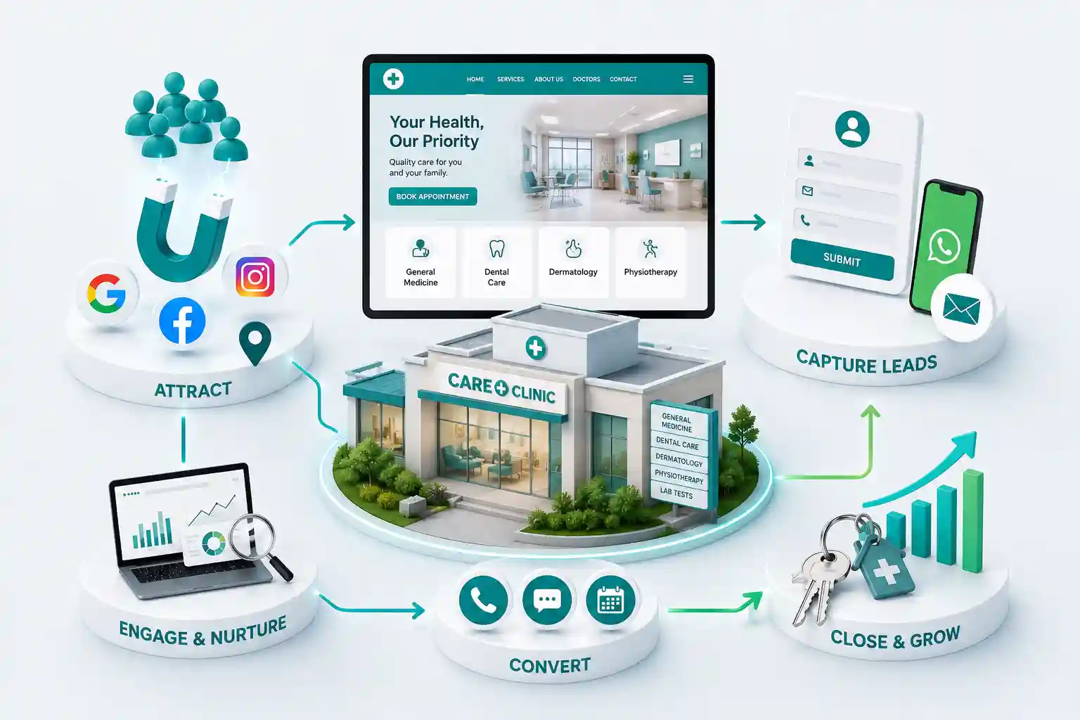
Healthcare Website Design Trends in 2026: What Patients Expect Today
A website UX guide for clinics: clearer care discovery, usable practitioner profiles, appointment paths, accessible forms, and dependable content operations. This guide covers seven 2026 website design priorities for clinics and healthcare organizations: task-based navigation, service pages, practitioner profiles, booking UX, accessible interaction, privacy-conscious content, and maintainable operations. It focuses on website UX only. It does not provide medical advice, treatment recommendations, or guarantees about appointment outcomes.
Healthcare websites often carry accurate information but present it as a maze of department names, long PDFs, and generic contact buttons. A person trying to arrange an appointment may not know a clinical term, may be comparing several providers on a phone, or may need a simple answer about location, availability, and what to bring. When a site makes those basic tasks difficult, its design is failing as a service interface even if it looks modern. A clinic website is usually an early touchpoint in a wider administrative journey. It should help visitors find the information and contact route that fits their need without making clinical claims or trying to diagnose. Clear information architecture, reliable practitioner details, and an understandable booking handoff reduce avoidable confusion for visitors and staff alike. The standard is not a flashy patient portal; it is a calm, accurate path to the next appropriate administrative step.
This guide covers seven 2026 website design priorities for clinics and healthcare organizations: task-based navigation, service pages, practitioner profiles, booking UX, accessible interaction, privacy-conscious content, and maintainable operations. It focuses on website UX only. It does not provide medical advice, treatment recommendations, or guarantees about appointment outcomes.
It is written for clinic managers, operations teams, practice owners, communications staff, and agencies improving a public-facing healthcare website. The framework can be adapted to a single clinic or a wider provider group by matching each page and workflow to local operational ownership.
1. Organize navigation around patient tasks
The strongest healthcare website trend is task-based structure. Visitors should be able to find a service, explore a practitioner, understand appointment options, locate a facility, and get in touch without first learning the organization chart. That means testing menu labels with the words people actually use and separating public information from systems that require an existing account. A large menu of departments may be familiar internally, but it is not automatically a useful starting point for a first-time visitor.
Start with a short list of high-frequency tasks drawn from reception, call logs, and web searches. Give each task a clear route from the homepage and a stable page to land on from search. Keep urgent or time-sensitive instructions prominent where the organization has approved them, but avoid turning general website copy into individualized clinical direction. The design should orient and route people, not substitute for a qualified professional.
2. Make service pages easy to scan and maintain
Service pages should answer administrative questions clearly: what the service is called, whom it is intended to help in broad terms, which practitioners or teams are connected to it, where it is available, and how to request an appointment or enquiry. Use short sections, descriptive headings, and links to related information rather than one undifferentiated wall of copy. If content needs medical review, build that review into the publishing process instead of letting outdated information remain visible while approvals are delayed.
Page templates should support careful boundaries. Explain preparation, access, or referral requirements only when those details are current and approved. Do not promise suitability, timing, or treatment results through a marketing page. A well-designed route can say what a visitor should expect from the administrative process and direct clinical questions to the appropriate channel. That is both clearer for the visitor and easier for a team to maintain.
3. Build practitioner profiles that answer practical questions
A practitioner profile helps a visitor move from a service category to a person or team with confidence. The useful information is often practical: professional role, areas of practice described accurately, qualifications or registrations as approved, languages, locations, and the route to book or enquire. A consistent layout makes profiles easier to compare and gives staff a predictable checklist when something changes.
Avoid profile designs that turn professional biographies into promotional claims. Portraits and personal statements can create warmth, but they should not crowd out basic availability and service context. If appointments are booked through a central team, make that visible. If a profile is no longer accepting a particular type of request, update the pathway rather than leaving a dead-end button. The most patient-friendly design is often the one that tells the truth early.
Practitioner profile UX
Element
Visitor need
Operational check
Role and focus
Identify a relevant professional
Use approved, current descriptions.
Locations
Plan a visit or contact path
Keep schedules and locations synchronized.
Languages and access notes
Assess communication fit
Publish only verifiable information.
Booking route
Take a next step
Reflect the real routing model.
Related services
Understand context
Link to maintained service pages.
4. Design booking as a complete journey
A booking interface is not complete because it has a calendar. It needs clear entry rules, sensible choices, accessible fields, confirmation, and a recovery path when a desired option is unavailable. Decide whether the journey is a request, a direct reservation, a callback request, or a handoff to another system, then use language that accurately describes it. Saying “book now” when staff will review a request creates avoidable expectations.
On mobile, ask for the minimum information needed at that stage. Make choices such as service, location, preferred contact method, and time understandable without excessive scrolling. Explain required fields before submitting and retain entries after a validation error. A confirmation should state what was received, what happens next, and where to get administrative help; it should not imply clinical advice or certainty that has not been provided.
Planning a clearer clinic website journey?
Discuss your service structure, booking process, and content ownership in a consultation focused on practical clinic website UX.
5. Make accessibility a design baseline
People access healthcare websites with a broad range of devices, input methods, language confidence, and assistive technologies. Design for this reality from the beginning: readable type, logical headings, sufficient contrast, keyboard access, descriptive buttons, labelled inputs, and clear error messages. Do not rely on colour, gesture, or a hover state as the only way to understand a choice. These are small implementation decisions with a large effect on whether someone can complete a basic task independently.
The W3C WCAG guidance is a useful source for setting shared standards. Review entire journeys—not only individual controls—because a form that is technically labelled can still fail a visitor if the error summary, confirmation, or third-party booking handoff is inaccessible.
Plain language belongs in the same baseline. Short, direct sentences and meaningful headings make administrative information easier to understand without oversimplifying approved content. Where a term must be used, add context around it. Translation, interpretation, or communication-support routes should be easy to find where the organization offers them.
6. Keep privacy, trust, and performance visible
Visitors share contact details reluctantly when they do not know how a request will be handled. Place a concise, accurate privacy notice near forms and explain the operational purpose of the information collected. Avoid collecting sensitive detail through a generic website form unless the organization has a deliberate, reviewed process for doing so. The right amount of data is the amount needed to move the administrative request forward safely.
Trust also depends on basic technical reliability. Pages should load without disruptive layout shifts, maps and booking scripts should not bury content, and contact methods should work on the device in hand. Performance is especially important for people who are accessing the site under time pressure or on an ordinary network. Audit individual service, profile, and booking templates because each can carry a different technical burden.
7. Maintain the site as an operational service
A polished launch loses value quickly if clinicians change, locations move, booking rules change, or a service page is no longer reviewed. Give each content type an owner, a source of truth, and a review path. Maintain a simple log of external booking links, forms, phone numbers, and template components. That record helps teams respond quickly when an operational change is announced instead of discovering a broken route through visitor complaints.
Use evidence to prioritize improvements: incomplete booking requests, reception questions, search queries, form errors, and accessibility feedback all point to tasks the current site is not supporting. A modest correction to a label or form can be more valuable than a broad visual redesign. Explore the
They expect a clear way to find services, understand practical options, review practitioner information, request or manage appointments, and get help on a phone. The website should make administrative tasks easier without offering individualized medical advice.
Use an approved service description, relevant practitioner or team links, location and access information where applicable, a clear administrative next step, and current supporting resources. Keep clinical claims and requirements within the organization's review process.
Use wording that matches the process. “Request an appointment,” “Book an available time,” and “Ask for a callback” are different promises. Explain what happens after the action so visitors know whether a request is confirmed or under review.
Yes, when they help visitors understand roles, approved focus areas, locations, and the correct next step. Keep their layout consistent and update them whenever professional or operational details change.
Use logical headings, readable contrast, keyboard-operable controls, labelled forms, useful error messages, descriptive links, and testing with assistive technologies. Include third-party booking paths in the review.
Collect only what the administrative process genuinely needs at that point and use a deliberate, reviewed workflow for more sensitive information. A shorter form is often clearer and easier to complete.
Many visitors research and contact clinics from phones. Large tap targets, short forms, retained entries after errors, and a clear confirmation path help people complete an administrative request without unnecessary friction.
Update information whenever a service, practitioner, location, contact route, or booking rule changes. A scheduled audit of core pages and forms provides a second safeguard against stale public information.
This guide does not recommend that. Public pages should follow the organization's content governance and direct people to appropriate professional or urgent-care channels for individualized concerns.
Patients find your clinic online, then leave before booking. Fix the friction in forms, doctor info, services, mobile speed, local SEO, and contact options.
Plan useful doctor profile pages with verified credentials, clear scope, practical availability, accessible content, and appointment paths that help patients choose confidently.
Healthcare websites that build patient trust, simplify appointments, and help clinics grow. Available for doctors and hospitals across major Indian cities. Every page is planned for stronger search visibility, faster performance, clearer customer journeys, and measurable enquiries.
My Perfect Solutions helps brokers, clinics, restaurants, and growing brands launch fast, SEO-ready websites that turn search traffic into qualified enquiries across India.