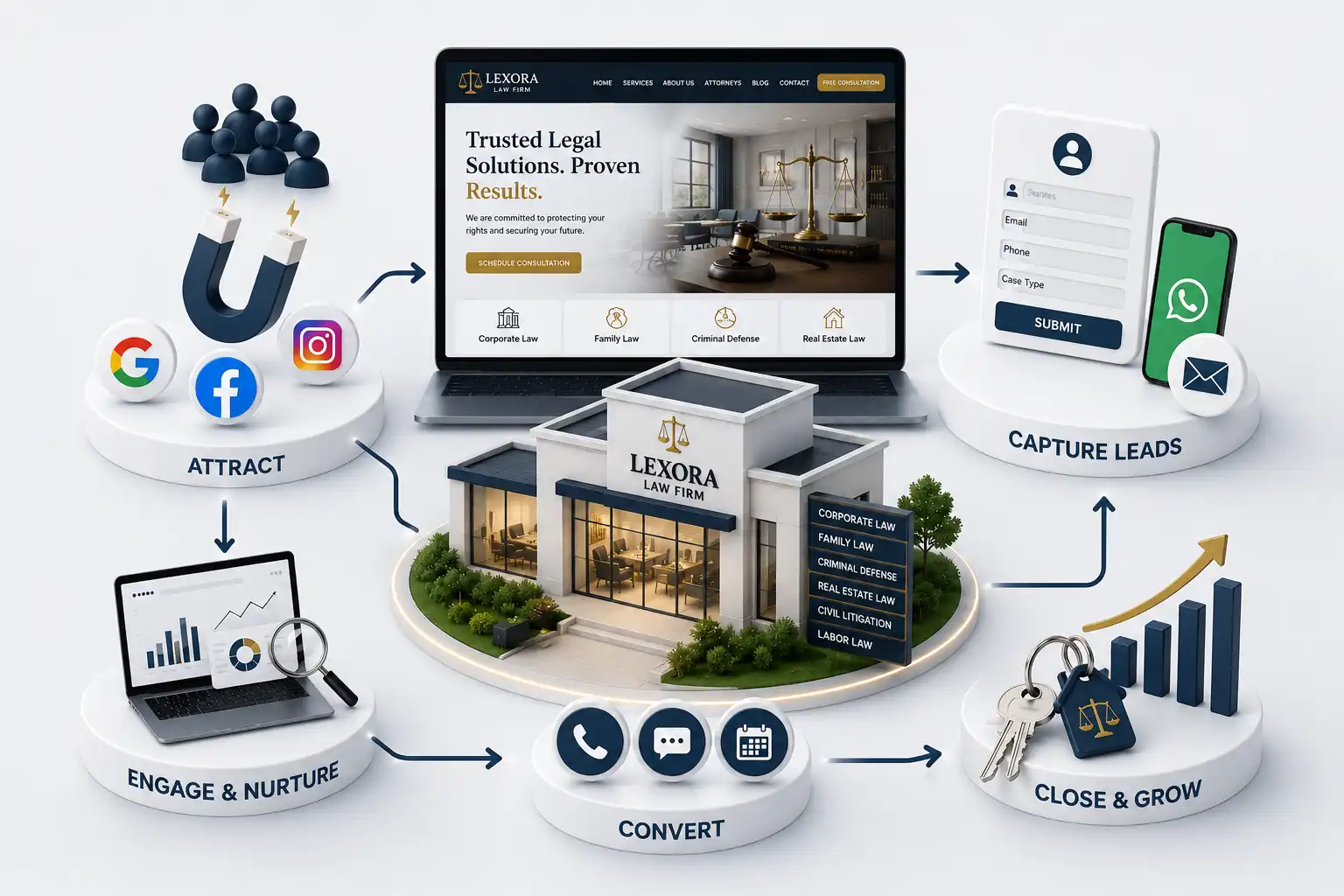
Law Firm Website Design Trends in 2026: 15 Features Every Attorney Needs
A practical 2026 law firm website design guide covering trust, practice architecture, mobile consultation paths, accessibility, and durable content operations. This guide sets out 15 design priorities grouped into seven practical areas: visitor journeys, practice architecture, attorney proof, mobile consultation, accessible interaction, performance, and editorial operations. It is a website strategy guide, not legal advice, advertising-rule advice, or a promise about client acquisition or case outcomes.
A law firm can have experienced attorneys and a respected reputation while its website still makes prospective clients work too hard. Visitors land on a broad homepage, struggle to identify the right practice, cannot tell whether an attorney handles their situation, and meet a generic contact form only after several uncertain clicks. A visual refresh alone does not resolve that journey. In 2026, the useful design trend is a site that organizes professional information around the decisions a stressed, busy visitor must make. People research legal services with different levels of urgency, knowledge, and comfort using the web. They may compare firms during a short break, on a phone after hours, or after a referral has given them one name to investigate. The site needs to communicate relevance, professional identity, and a realistic next step without overstating what the firm can do. When those basics are clear, marketing traffic and referrals have a better chance of becoming a responsible intake conversation.
This guide sets out 15 design priorities grouped into seven practical areas: visitor journeys, practice architecture, attorney proof, mobile consultation, accessible interaction, performance, and editorial operations. It is a website strategy guide, not legal advice, advertising-rule advice, or a promise about client acquisition or case outcomes.
It is for managing partners, marketing leads, firm administrators, intake teams, and agencies planning a law firm website redesign. The ideas work for a focused practice or a larger team because they begin with shared visitor jobs and operational capacity rather than a fixed visual style.
1. Design around client decisions, not homepage decoration
The first priority is to identify what a visitor needs before they are comfortable contacting the firm. Usually that means confirming the matter is in scope, understanding who may help, checking basic credibility, learning how an initial conversation works, and choosing a contact channel. A modern interface should make those answers easy to scan. Large headlines, motion, and editorial photography can support the experience, but none should obscure the route to a practice page or consultation action.
Start a redesign with a decision map, not a collection of competitor screenshots. Ask intake staff which enquiries arrive in the wrong queue, which questions are repeated before a consultation, and where prospective clients abandon a form. Then give each template a job: the homepage orients, a practice page qualifies, an attorney page establishes relevance, and a contact flow collects only what the team can use. This removes the pressure to make every page do everything at once.
2. Make practice architecture obvious before adding more content
Practice navigation is a design feature, not merely a menu label. Group services in language prospective clients can recognize, keep the number of top-level choices manageable, and give important practices their own durable destination. Each page should state the matters it addresses, explain the firm's role in plain language, introduce relevant people or process information, and provide a next step. It should not try to replace a legal consultation or make outcome promises.
A useful practice page often leads with a precise audience statement, then uses sections for common scenarios, the firm's approach, the people involved, and questions a visitor can answer before reaching out. Related-practice links can be helpful when they follow genuine research paths. For example, a visitor may need to understand how two services connect; they should not be sent through a random block of keyword-heavy links. Consistent page patterns also make future updates safer for content owners.
Attorney pages in 2026 should be more than a credentials archive. They should help a visitor see whether a professional is relevant to the work they are researching. Lead with practice focus, role, languages where useful, and a concise explanation of how the attorney works with clients or a wider team. Follow with education, admissions, associations, publications, and other verifiable details. Use a consistent presentation so visitors do not have to relearn the page on every profile.
Profile design needs boundaries. Case stories, testimonials, and accolades should be reviewed under the firm's applicable professional obligations. If direct contact is not how intake operates, do not place an email link that creates that expectation. Instead, explain that a coordinator or intake team will make the first response and connect the profile to the appropriate consultation route. Transparency is more useful than a visually impressive but inaccurate contact experience.
Attorney page priorities
Feature
Visitor question
Design rule
Practice focus
Is this relevant to me?
Put it before a long biography.
Credentials
Why trust this professional?
Use accurate, readable source material.
Working style
What happens next?
Describe process, not outcomes.
Practice links
Where can I learn more?
Link only to active relevant services.
Consultation action
How do I begin?
Match the real intake workflow.
4. Make mobile consultation paths simple and truthful
Mobile design is where a firm's operational choices become visible. A prominent phone action helps only when calls are answered or messages are handled reliably. A booking link helps only when calendars, confirmation, and follow-up ownership are understood. A short request form is often the most dependable shared path because it can ask for contact details, practice interest, preferred contact method, and a brief description without forcing a detailed account into a small screen.
Use one primary action per page context and repeat it after meaningful proof or explanation. Keep labels concrete: “Request a consultation” is clearer than “Learn more.” Make tap targets comfortable, preserve selected options when a form error occurs, and state what happens after submission. Do not call an automated acknowledgment a consultation confirmation. Thoughtful microcopy sets expectations without treating a worried visitor as a conversion metric.
Planning a more useful law firm website?
Bring your practices, team structure, and current intake process to a consultation about a site that supports clear professional contact.
5. Build accessibility into every template
Accessibility is not a finishing task for a legal-services website. Navigation must work by keyboard, headings must communicate the page structure, images need meaningful alternatives when they convey information, and form errors must be understandable without colour alone. These details make pages easier to use for many visitors, including people using assistive technology, a phone in poor conditions, or a keyboard instead of a pointer.
Use the W3C Web Content Accessibility Guidelines as a reference when defining acceptance criteria. Treat it as a design and development responsibility, then test complete journeys such as navigation, practice discovery, and consultation requests.
Avoid design systems that depend on faint text, hover-only menus, unlabeled icons, or modal windows that trap focus. These patterns can make a site feel sleek in a static mockup while making it less usable in reality. A small, well-tested set of components is usually more valuable than a large library of inconsistent interactive effects.
6. Balance professional visuals with performance and clarity
Professional imagery, restrained typography, and space for reading can establish a considered identity. Yet visual polish should not delay the information visitors came to find. Reserve space for images to reduce layout movement, size assets for their rendered context, and avoid decorative video that competes with page loading or body copy. Test pages on ordinary mobile networks as well as office connections; the experience that matters is the one a prospective client actually has.
Performance review should be template-specific. A practice page may carry different media and scripts from an attorney profile or contact form. Monitor the effect of third-party booking tools, review widgets, maps, and tag managers rather than treating a passing homepage audit as proof that the whole site is fast. The goal is dependable access to information and actions, not a score used as a marketing claim.
7. Govern content after launch instead of freezing it
The final trend is operational: websites need owners. Establish a simple review rhythm for attorney biographies, practice descriptions, office details, contact methods, and policy language. Give each content type a source of truth and record who can approve edits. This avoids a familiar problem where an attractive launch gradually becomes unreliable because a new attorney, retired service, or changed intake rule never reaches the website.
Plan the next release from evidence. Review search terms, navigation paths, form errors, call handling feedback, and questions staff receive. Then make a small, testable change to the page or workflow that owns that question. This is more sustainable than a redesign cycle driven only by fashion. For an intake-specific next step, see the
“A contemporary law firm website does not need to look louder. It needs to make relevance, credibility, and the next responsible step easier to understand.”
Priorities include clear practice architecture, useful attorney pages, mobile-first consultation paths, accessible components, honest trust signals, performance-aware media, and ongoing content ownership. They improve the clarity of a visitor journey rather than adding novelty for its own sake.
Use video only when it supports a clear message and does not delay access to practices, attorney information, or contact actions. A concise headline, relevant image, and visible next step are often more useful.
Show the primary services a firm actively offers and can route well. Group related services when necessary, then validate the labels with real visitor and intake questions rather than relying on internal terminology alone.
Include current practice focus, credentials, admissions or associations where applicable, a concise professional narrative, links to relevant practices, and a contact route that reflects the actual intake process. Keep all claims accurate and review them appropriately.
No. Chat is useful only when staffing, escalation, privacy, and response expectations are defined. A reliable short form or clear callback process is preferable to an unattended widget that implies immediate help.
Use semantic headings, keyboard-operable navigation, readable contrast, labelled forms, useful error messages, meaningful image alternatives, and tests of complete visitor journeys. Refer to WCAG and include accessibility in design and development review.
Choose the action your team can fulfill consistently: a monitored call, a consultation request, or a booking flow with clear ownership. Keep the label specific and tell visitors what happens after they use it.
Review time-sensitive details whenever the underlying service or team changes, and set a recurring audit for biographies, practice pages, office information, forms, and links. Ownership is more important than a rigid calendar.
No. Website strategy can improve structure and usability, but a firm should obtain appropriate professional advice for jurisdiction-specific advertising, privacy, accessibility, and legal-content obligations.
Google Ads can fill the phone this week. A strong law firm website builds trust, compounds organic demand, and stops paid traffic from bouncing. Here is how to choose—and when to use both.
Build a law firm consultation booking path that qualifies enquiries, sets expectations, supports scheduling, and reduces missed appointments without giving legal advice.
Prioritize law firm website features that convert clients: practice pages, attorney profiles, intake forms, trust signals, and a clear mobile CTA hierarchy.
Plan law firm website development cost in India by practice scope, attorney profiles, intake workflows, redesign depth, SEO, timeline, and phased maintenance.
Law firm websites with practice areas, attorney profiles, and enquiry flows that convert visitors into client consultations. Available for firms across major Indian cities. Every page is planned for stronger search visibility, faster performance, clearer customer journeys, and measurable enquiries.
My Perfect Solutions helps brokers, clinics, restaurants, and growing brands launch fast, SEO-ready websites that turn search traffic into qualified enquiries across India.