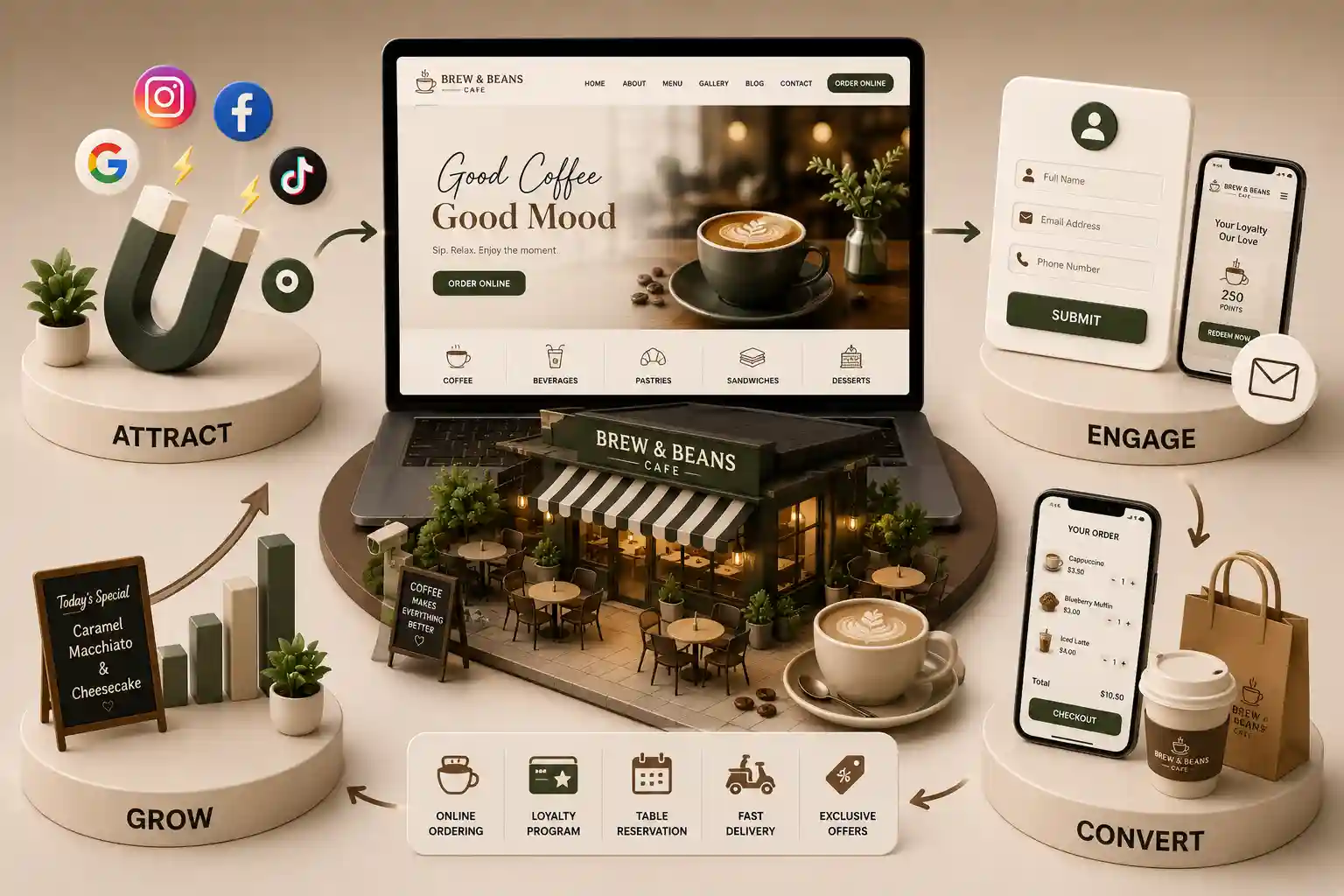
Cafe Web Development9 min read
Cafe Website Design Austin (2026)
A practical Austin cafe website design guide for turning local discovery, menus, and mobile ordering into repeat visits.
Read: Cafe Website Design Austin (2026)
Explore the best coffee shop website design examples as practical US patterns for menus, pickup, multi location hubs, and cafe brand storytelling. This guide explains why design matters, what great cafe sites share, fifteen practical design pattern examples, trends worth following, and mistakes that make inspiration useless.
Introduction
Cafe owners collect cafe website inspiration that looks beautiful yet still leave guests stuck behind PDF menus, buried hours, and weak order buttons. Mood boards rarely translate into coffee shop website design that sells drinks. In 2026, US guests decide in seconds on mobile. Best coffee shop website design examples earn attention because they clarify what you serve, where you are, and how to order without friction.
This guide explains why design matters, what great cafe sites share, fifteen practical design pattern examples, trends worth following, and mistakes that make inspiration useless.
It is written for owners and marketers planning cafe website development or a redesign in the United States.
A strong coffee shop web design reduces questions at the register and increases higher margin direct pickups. Guests who cannot find milk alternatives or pickup timing abandon your site and open a marketplace app instead.
Design also shapes trust. Real cups, clear lighting, and specific neighborhood cues outperform stock photos. Cafe website examples that feel honest convert better than polished templates that could belong to any city.
For US market builds and city pages, review our cafe web development hub for the United States, including Dallas, Charlotte, and Austin.
Great coffee shop website design answers guest jobs fast: menu, hours, location, order or visit CTA, and proof. Speed matters because image heavy cafe sites often fail Core Web Vitals after photo dumps.
Operations fit matters too. Patterns only work when staff can update sold outs and seasonal drinks without a developer ticket. Cafe website development that ignores update workflows creates beautiful sites that go stale in a week.
Pair these patterns with our cafe website features guide and avoid traps in common cafe website mistakes.
These best coffee shop website design examples are named archetypes, not a ranked list of third party brands. Use them as cafe website inspiration you can adapt to your bar capacity and brand voice.
Craft and quality conversations that shape specialty branding often connect to the Specialty Coffee Association. Use those standards as story fuel, then keep coffee shop web design focused on guest action.
Ready to apply a pattern? Review cafe web development, browse the portfolio, read about us, or contact us. For growth outcomes, see how a professional cafe website increases orders.
Final thoughts: cafe website examples only help when you ship one improvement at a time and measure pickups. Inspiration without an operations owner becomes another abandoned redesign folder.
Start with the pattern closest to your busiest daypart. A commuter pickup hub pattern will not rescue a seating focused shop that mostly needs clearer hours and wifi notes. Match the archetype to real guest behavior.
Budget for photography compression and menu admin training alongside design. Those unglamorous lines decide whether coffee shop website design stays fast and accurate after launch week.
Share pattern decisions with bar leads before the design kickoff. When baristas know why a pickup hub layout was chosen, they give better feedback on modifiers and timing. That collaboration turns best coffee shop website design examples into something the whole team can operate.
Keep a short reject list of patterns you will not copy this year, such as autoplay video or account walls before menu browsing. Writing those rejections down prevents coffee shop website design debates from restarting every time a new mood board appears.
Turn cafe website inspiration into a live build
Share your concept, locations, and ordering goals. We will map the right design patterns into a conversion ready cafe website.
Open your coffee shop website on a midrange phone and time how long it takes to find hours, a signature drink, and the order button. If any of those jobs take more than a few taps, the design is competing against guest patience rather than helping it.
Screenshot the first screen of your homepage and menu. Ask whether a stranger could tell what you serve, where you are, and what to do next. Best coffee shop website design examples always answer those questions before they chase animation or brand poetry.
Single location specialty shops should copy menu first clarity and pickup timing. Multi location groups should copy location selectors and inventory aware ordering. Roastery cafes should copy education pages that still end in a clear product or visit CTA.
Useful 2026 cafe website inspiration includes larger tap targets, compressed drink photography, sticky order buttons, and short wifi or seating notes near hours. Trends that hurt include autoplay video, hover only filters, and homepage carousels that delay the menu.
Accessibility is also a design trend with commercial upside. Readable contrast and keyboard friendly forms help more guests finish cafe online ordering and reduce support tickets for confused checkouts.
Copying a beautiful aesthetic while keeping a PDF menu is the most common failure. Cafe website examples only create value when the pattern improves discovery, trust, or conversion. Aesthetic alone is not a strategy.
Share the audit results with bar leads, not only designers. When baristas see which layouts reduce incomplete tickets, they become better partners for photography and specials. That collaboration turns cafe website inspiration into operational improvement.
Revisit your inspiration board quarterly. Neighborhood competition and guest habits change. A pattern that worked last winter may slow summer iced drink launches if photography weight or CTA placement is wrong.
Document why you rejected certain cafe website examples. Teams that forget those decisions repeat expensive redesign debates after staff turnover. A short note keeps coffee shop web design focused on guest jobs.
When ownership asks for a full visual refresh, bring conversion data from the current layout. Best coffee shop website design examples teach that restraint often outperforms a dramatic rebuild that breaks ordering for a month.
Create a one page pattern brief before hiring designers. List the guest jobs, the archetype you chose, and the metrics that will prove success. Cafe website inspiration without a brief turns into subjective debates about fonts while pickup completion stays flat.
Photograph drinks in natural light and compress aggressively. Many coffee shop website design failures come from beautiful but enormous media. A fast menu with honest photos outperforms a glossy gallery that never finishes loading on LTE.
If you operate wholesale and retail together, separate those journeys visually. Trade buyers and morning commuters want different proof. Cafe website examples that mix both audiences on one crowded homepage confuse both.
Rehearse the update workflow with the person who will publish seasonal drinks. If that person needs a developer for every price change, the nicest coffee shop web design will rot. Admin simplicity is part of the pattern you are copying.
Finally, revisit competitors quarterly with the same audit script. Neighborhood shops evolve. Best coffee shop website design examples in your market shift, and your backlog should shift with them instead of freezing after one redesign.
FAQ
No. Copy the guest jobs the layout solves, not the visual identity. Best coffee shop website design examples teach structure and clarity. Blind clones look inauthentic and often break on your menu complexity. Keep the decision tied to bar capacity so coffee shop website design stays operable.
Never. Roastery stories help brand preference, but cafe website development should still end education pages with a clear buy, visit, or subscribe action. Education pages should still support cafe website development goals with a clear CTA.
A practical Austin cafe website design guide for turning local discovery, menus, and mobile ordering into repeat visits.
Read: Cafe Website Design Austin (2026)The Austin coffee shop website features that make menus, pickup, catering, and local discovery easier for guests and teams.
Read: Coffee Shop Website Features AustinBuild an Austin coffee shop local SEO system that connects accurate location details, useful content, Google visibility, and direct orders.
Read: Local SEO for Coffee Shops in AustinPlan cafe website budgets in the USA with clear cost bands for menus, pickup ordering, catering, timelines, and coffee shop growth ROI.
Read: Cafe Website Development Cost in the United States (2026 Guide)Need professional help?
Warm, conversion-focused cafe websites that highlight your menu, vibe, and drive more foot traffic and orders. Available for cafes and coffee shops across major Indian cities. Every page is planned for stronger search visibility, faster performance, clearer customer journeys, and measurable enquiries.
Professional Website Development & SEO Experts
My Perfect Solutions helps brokers, clinics, restaurants, and growing brands launch fast, SEO-ready websites that turn search traffic into qualified enquiries across India.