Cafe Web Development9 min read
Coffee Shop Website Features Austin
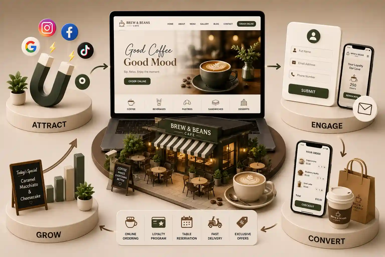
The Austin coffee shop website features that make menus, pickup, catering, and local discovery easier for guests and teams.
Read: Coffee Shop Website Features Austin
A practical Austin cafe website design guide for turning local discovery, menus, and mobile ordering into repeat visits. This guide explains how to structure an Austin cafe site in 2026, prioritize menu and ordering experiences, support local discovery, and measure the actions that matter after launch.
Introduction
Austin cafes often invest in a strong interior and roast program, then send mobile guests to a slow site where today’s menu, hours, and pickup link are difficult to find. That gap loses the moment when a commuter, visitor, or nearby regular is deciding where to stop. Cafe website design Austin decisions have an operational consequence. A clear site sends better-prepared guests to the counter, gives catering prospects a direct route, and lets a distinctive neighborhood brand compete without relying only on delivery marketplaces.
This guide explains how to structure an Austin cafe site in 2026, prioritize menu and ordering experiences, support local discovery, and measure the actions that matter after launch.
It is for independent cafe owners, multi-location operators, and hospitality marketers serving Austin, Downtown, South Congress, Round Rock, or Cedar Park.
Most guests do not arrive on a cafe website looking for a brand manifesto. They want to know whether the shop is open, what is on the menu, whether a drink can be ordered ahead, and how the place fits the moment. A Downtown visitor may need directions before a meeting; a South Congress regular may want the seasonal drink list; a Round Rock parent may be checking a catering option. Put those answers in a stable mobile hierarchy before visual experiments.
Start each page with a concise value proposition, one primary action, and a route to menu or location details. The visual system can still carry the cafe’s personality through photography, type, and color, but it should never make basic information harder to scan. Good Austin cafe design feels specific without requiring guests to decode it.
Consider the time and context behind the visit. A guest standing on Congress Avenue in summer may be shielding their screen from glare and looking for cold brew, while someone in Cedar Park may be planning a relaxed Saturday stop with children. Large tap targets, concise labels, and a visible address reduce hesitation in both cases. If a page asks people to scroll past a full-screen image before revealing hours or the menu, it is prioritizing the brand presentation over the decision that brought them there.
A menu page deserves the same care as an ecommerce product experience. Use readable category labels, current prices, short descriptions, allergen or milk-alternative notes where relevant, and a visible order action. Do not make guests pinch-zoom a PDF or hunt through social posts for a drink that may no longer be available. A staff-managed menu also avoids the embarrassment of promoting a sold-out seasonal item for weeks.
For an Austin concept with food, coffee, retail beans, and rotating specials, give each job an intentional path. Keep everyday drinks easy to browse, use a seasonal module for limited offers, and place wholesale or catering information behind a focused form rather than a vague email address. That separation helps guests while giving the team better lead context.
Online ordering is not automatically a conversion win if it creates tickets the bar cannot fulfill. Work backward from the morning rush: which drinks can be prepared ahead, how far ahead can a guest select a pickup time, and which modifiers need guardrails? The website should reflect those rules. A simple, reliable pickup flow is more valuable than a complicated checkout that promises speed and leaves baristas managing exceptions.
Use plain labels for timing, substitutions, and sold-out states. Confirm the order system returns guests to a clear confirmation page, and test it on a typical phone connection. When the experience is sound, direct ordering can become a useful first-party relationship rather than a handoff to another marketplace.
Design the handoff between the website and the bar with as much care as the checkout itself. If pickup is at a side window, say so before payment; if large orders need extra lead time, surface that rule before a guest builds a cart. Give staff a short way to pause ordering when capacity changes, and make the unavailable state honest rather than letting orders fail later. These details turn a digital convenience into a calmer in-person arrival for guests and the team.
For implementation options, start with our cafe web development service and the Austin-specific cafe development page.
A city homepage alone cannot speak equally well to every area an operator serves. Create a useful location page for each real shop, including address, hours, directions, parking or transit notes, photos from that location, and the ordering path guests should use. Downtown, South Congress, Round Rock, and Cedar Park audiences may share a brand, but their visit logistics are different.
Avoid manufacturing pages for neighborhoods where there is no location or service reality. Instead, write local details that a guest can verify and keep the name, address, and phone consistent with the business profile. Google’s guidance in
Google Business Profile Help is a useful reference for maintaining accurate public business information.
Cafe photography should show what a new guest is actually choosing: drinks, food, seating, counter energy, and the character of the space. Use compressed images, meaningful alt text, and enough contrast that menu and order controls remain readable in bright Texas daylight. A moody art direction cannot justify a site that makes a menu illegible or adds seconds to a checkout.
Accessibility makes the website better for more than compliance. Logical headings help screen-reader users scan the menu, keyboard-friendly controls help guests complete a form, and visible focus states make small interactions less error-prone. These practices also create a more resilient site when a guest is navigating with one hand while walking to the shop.
A cafe website should recognize that revenue comes through several doors. Catering organizers want capacity, notice requirements, sample packages, and a reply promise. Wholesale buyers need minimums, service areas, and a clear contact. Event planners may need a private-booking route. Give each visitor a short, purpose-built form that captures only the information the team needs to make the next conversation useful.
Then connect each action to an owner. A form that lives in an unloved inbox is not lead generation. Establish a response standard, confirmation email, and tracking event before publishing campaigns. The best web design converts demand only when the operating team can keep the promise made on screen.
Use page content to qualify requests without making prospects work for an answer. A Downtown office manager may need to know whether an early meeting delivery is possible, while a South Congress event planner may care about service style and minimum spend. A brief package overview, lead-time guidance, and an example of what happens after submission set realistic expectations. They also help the right inquiries reach the shop while saving staff from repeatedly explaining information that belongs on the site.
Plan an Austin cafe website that works
Get a focused roadmap for menus, local discovery, ordering, and conversion paths that fit your operation.
Track completed pickup orders, menu-to-order clicks, calls, direction requests, catering submissions, and form errors. Those actions reveal whether a page is helping guests or merely attracting attention. Review them by location and device: a Cedar Park landing page can have a different job from a Downtown page, and mobile friction often appears before desktop reports show a problem.
Use a monthly review to update hours, menus, images, promotions, and unanswered questions from the counter. Website design is not a one-time visual deliverable. It is a living part of the guest experience, and small maintenance habits protect its value across seasonal launches and busy weekends.
Pair the numbers with a small set of real-world checks. Once a month, have someone outside the business find the shop through search, locate the current menu, request directions, and begin an order without coaching. Compare that experience with the questions staff heard during the same period. If guests repeatedly ask whether a Downtown location has parking validation or whether a Cedar Park order is ready at the counter, the answer may need a clearer place on the site. Qualitative feedback explains why a metric moved and prevents teams from optimizing a dashboard while a simple visit detail remains hidden. Keep a short change log, too: record the date a menu label, pickup instruction, or location photo changed, then look for changes in completed actions over the following weeks. That history turns a redesign conversation from opinion into a sequence of evidence-based improvements. Share the findings with the people who work the register, because they can tell whether the data matches the questions guests ask in person.
Audit the current site from a guest’s perspective: find today’s hours, a favorite drink, a pickup link, and a catering path on a phone. Fix the largest blocker first, then sequence menu structure, location pages, performance, and analytics. A focused release beats a broad redesign that keeps the most important paths unresolved.
See our portfolio, learn about our approach, compare Austin’s coffee shop website features and local SEO guide, or read our national guides to cafe website features and local SEO for cafes.
FAQ
At minimum, include current menus, hours, location details, a clear order or visit action, real photos, and a reliable catering or contact route. Add features only when staff can support them.
Menu and ordering paths should feel fast on midrange phones. Compress imagery, avoid unnecessary scripts, and test the experience after each major content update.
The Austin coffee shop website features that make menus, pickup, catering, and local discovery easier for guests and teams.
Read: Coffee Shop Website Features AustinBuild an Austin coffee shop local SEO system that connects accurate location details, useful content, Google visibility, and direct orders.
Read: Local SEO for Coffee Shops in AustinPlan cafe website budgets in the USA with clear cost bands for menus, pickup ordering, catering, timelines, and coffee shop growth ROI.
Read: Cafe Website Development Cost in the United States (2026 Guide)See the cafe website features that help US guests find menus faster, order pickup, discover locations, and trust your coffee shop brand on mobile.
Read: 12 Features Every Coffee Shop and Cafe Website Should HaveNeed professional help?
Explore US Cafe Web Development pages. Every page is planned for stronger search visibility, faster performance, clearer customer journeys, and measurable enquiries.
Professional Website Development & SEO Experts
My Perfect Solutions helps brokers, clinics, restaurants, and growing brands launch fast, SEO-ready websites that turn search traffic into qualified enquiries across India.