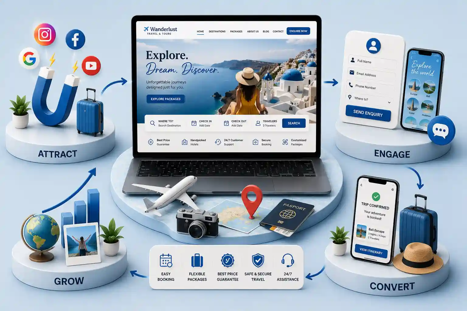
Travel Agency Website Features That Convert Enquiries
Turn package and itinerary interest into qualified travel enquiries with clear trip pages, trust signals, fast forms, and follow-up-ready website features. This guide covers the travel agency website features that convert package and itinerary interest into qualified enquiries: focused trip pages, scannable itinerary design, pricing context, mobile-first forms, trust proof, and lead handoff. It is universal website strategy, so the examples can be adapted to the trips and markets an agency actually serves.
Many travel websites showcase striking destination imagery but make a visitor work too hard to understand a package or start a conversation. Itineraries sit in downloadable files, inclusion details are vague, enquiry buttons disappear after the hero, and forms ask every question before a traveller has decided whether the trip fits. The result is interest without usable enquiries. A package or custom itinerary is rarely an instant checkout decision. Travellers compare dates, group suitability, accommodation expectations, and what is included before they trust an agency with their details. A conversion-focused website shortens that research path and hands the sales team the context needed for a relevant response.
This guide covers the travel agency website features that convert package and itinerary interest into qualified enquiries: focused trip pages, scannable itinerary design, pricing context, mobile-first forms, trust proof, and lead handoff. It is universal website strategy, so the examples can be adapted to the trips and markets an agency actually serves.
It is for agency owners, tour operators, travel consultants, and marketing teams planning a new website or improving an existing enquiry path. It applies whether the agency sells fixed departures, group tours, bespoke itineraries, or a combination of these.
Design around the package decision, not the homepage
A visitor who arrives on a travel site is trying to answer practical questions: Is this the kind of trip I want? Does it suit my dates, group, and comfort expectations? What is included? Can this agency help me make it happen? Start with those jobs rather than a generic feature list. A beautiful homepage can inspire, but the package page is where a traveller decides to enquire.
Give every actively promoted package or itinerary a stable, shareable page. Its first screen should name the experience, establish the intended traveller, show the likely duration or timing context, and offer one clear next step. That may be “Get this itinerary,” “Check availability,” or “Plan a similar trip.” Avoid a primary button that says only “Submit”; it does not explain the outcome.
Build package pages that qualify before the form
A useful package page balances inspiration with decision-making detail. Lead with a concise summary of the experience, then make the essentials easy to scan: itinerary, accommodation level, transport approach, inclusions, exclusions, suitable group types, and any flexibility. Visitors should not need to call merely to discover whether a trip is relevant. Clear detail tends to produce fewer vague leads and more conversations a consultant can advance.
A specific trip promise and audience statement
Duration, availability context, and trip pace where relevant
Clear inclusions and exclusions without hidden assumptions
A readable day-by-day itinerary or experience outline
Itinerary content is a conversion asset, not a wall of copy. Structure each day or stage around a place, activity level, travel time where useful, and accommodation or meal expectations. Let readers expand secondary detail instead of forcing everyone through a dense schedule. Strong headings allow a family, couple, or group organiser to recognise fit quickly while still giving careful planners enough substance to share the page.
Be precise without presenting uncertain arrangements as guarantees. If suppliers, timings, or activities can change, state the planning principle and explain how the agency will confirm final details. That clarity is more persuasive than overpromising. Pair the itinerary with practical answers on what is included, recommended preparation, and the level of support the traveller can expect.
Treat photos and maps as supporting evidence for the itinerary, not as a substitute for it. Caption images with places or experiences that appear in the schedule so visitors can connect inspiration to the actual plan. If a map is useful, keep it lightweight and secondary to the day-by-day outline. Heavy media that slows the page will push the enquiry CTA below the fold and reduce completion on mobile networks.
Clarify price context without forcing an early checkout
Not every travel product has one fixed price, but every visitor needs enough context to decide whether it is worth enquiring. Show a starting price, price range, or “priced after trip details” explanation that accurately reflects the offer. Explain the variables that affect a quote, such as season, group size, accommodation preference, or itinerary changes. Hiding every price signal may increase low-intent enquiries and erode confidence.
Price presentation choices
Offer type
Useful website treatment
Enquiry benefit
Fixed departure
Show per-person starting context and what changes it
Sets an informed expectation
Custom itinerary
Explain quote inputs and planning steps
Prompts better trip briefs
Group travel
Show group assumptions and request options
Captures organiser requirements
Shorten the enquiry flow, then enrich it later
The first form should help a consultant respond, not attempt to recreate a full booking system. Ask for name, preferred contact method, package or trip interest, approximate travel timing, party size, and an optional message. Pre-fill the package name when the form is launched from a trip page. This preserves context and prevents a visitor from repeating what they have just read.
Use progressive collection for secondary details. A confirmation page, follow-up email, or consultant call can gather room preferences, passport-related information, or long wish lists after genuine interest is established. Keep fields labelled, keyboard-accessible, and tested on a phone. A form that looks concise on desktop can still be frustrating if its inputs, error messages, or date controls are difficult to use on smaller screens.
Discuss package pages, itinerary content, and a lead path that fits your travel sales workflow.
Place trust where traveller doubt appears
Travel decisions involve money, personal details, and uncertainty, so reassurance belongs near the decision points. Use authentic reviews, clear business identity, meaningful policies, and photos that accurately represent the experience. A review carousel in the footer is weaker than relevant proof beside a package CTA or after a visitor reads what is included. Do not use stock badges or vague “best price” claims that cannot be substantiated.
Technical confidence matters too. Ensure the site is secure, pages load quickly on common connections, and contact details are consistent. Google’s Search documentation is useful background for publishing helpful, crawlable trip content, but people remain the priority: clear original pages and a reliable enquiry path serve both visitors and search visibility.
Route enquiries and set a response expectation
A high-converting form is only the start. Send the package name, source page, timing, and group size with each lead so the right consultant has context. Define ownership for incoming enquiries and tell the visitor what happens after submission: a confirmation, a typical response window, and the best next channel if the trip is urgent. Automation should support a timely human response, not create an unanswered inbox.
When multiple consultants handle different destinations or trip styles, route by package category rather than dumping everything into one shared mailbox. A clear owner and response SLA keep conversion gains from disappearing after the form is submitted.
Pass package and source-page context into the enquiry notification
Assign a clear owner or queue for every trip type
Send a useful confirmation with the submitted trip summary
Measure form starts, submissions, and qualified responses separately
Review lost leads with the sales team, not analytics alone
Improve the conversion path with evidence
Launch the basics first: complete package pages, readable itineraries, clear price context, a short form, and trustworthy contact information. Then compare enquiries by page, device, and package category. A page with many views but few form starts may need a clearer CTA. A form with starts but few submissions may ask too much. Decisions become more reliable when website data is discussed alongside sales-team feedback on enquiry quality.
Publish a simple internal scorecard after the first month: top package pages by enquiry rate, mobile versus desktop completion, average response time, and the share of leads that become a real conversation. Use that scorecard to decide whether the next investment should be content depth, form simplification, faster media, or better routing—not another decorative homepage module. Agencies that treat the website as a sales instrument improve conversion more consistently than agencies that only refresh visuals.
Prioritise focused package pages, scannable itineraries, clear inclusions and price context, short mobile enquiry forms, authentic trust proof, and lead routing that preserves trip context.
Each actively promoted, materially distinct package should have its own useful page. It gives travellers a shareable reference and lets the enquiry form preserve what interested them.
Start with contact details, trip or package interest, approximate timing, party size, and an optional message. Collect deeper preferences after the agency has confirmed interest and fit.
They need enough accurate price context for visitors to judge fit. That may be a starting price, a range, or a clear explanation of the variables used to create a quote.
Give enough day-by-day or stage-by-stage detail to explain the experience, pace, and inclusions. Keep secondary detail expandable so the page remains easy to scan.
Keep the primary CTA visible, use large accessible form controls, minimise required fields, test date and phone inputs on real devices, and repeat the next step after important content.
Use substantiated reviews, accurate business details, transparent policies, relevant imagery, secure pages, and clear response expectations. Place them near package decisions rather than only in the footer.
Track package-page views, CTA taps, form starts, submissions, response times, and the proportion of enquiries that sales considers qualified. Review these together rather than relying on traffic alone.
Chat is fast. Forms capture detail. See when travel agencies should lead with WhatsApp, when the website wins, and how a dual path stops lost package enquiries.
A practical 2026 launch guide for Indian travel agencies: choose the right MVP, publish package and destination pages, capture enquiries, and phase payments without overbuilding.
Plan a proportionate travel enquiry form with clear purpose, data minimisation, consent where appropriate, controlled document handling, access, retention, and incident response.
Plan itinerary pages that help travellers understand days, inclusions, pace, and next steps while staying useful for search without thin destination spam.
Travel websites with packages, itineraries, and enquiry flows designed to book more trips and tours. Available for travel agencies across major Indian cities. Every page is planned for stronger search visibility, faster performance, clearer customer journeys, and measurable enquiries.
My Perfect Solutions helps brokers, clinics, restaurants, and growing brands launch fast, SEO-ready websites that turn search traffic into qualified enquiries across India.