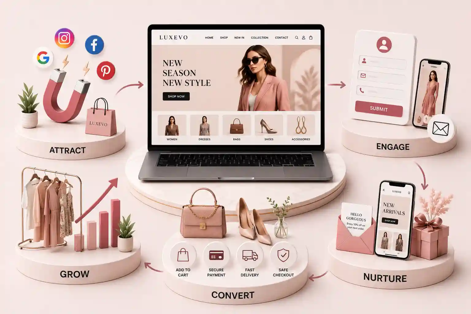
Build a fashion store that helps shoppers discover products, judge fit, trust the brand, and complete checkout confidently on every device. This guide explains the fashion website features that convert shoppers across discovery, product evaluation, checkout, fulfillment confidence, and ongoing optimization. It focuses on practical choices that can be tested: useful filters, complete product information, performance-aware media, mobile actions, and measurement tied to orders. The goal is a clear buying journey, not a checklist of expensive ecommerce add-ons.
Fashion stores often invest in striking campaigns and photography, then lose shoppers in the practical parts of buying. A collection page cannot be filtered, a product page leaves sizing vague, a colour choice resets the gallery, or checkout asks a phone visitor to complete a desktop-length task. The result is not necessarily a demand problem. It is a decision-path problem: the site gives people reasons to admire the product but too few reasons to choose it now. Shoppers cannot touch fabric, test a fit, or ask a store associate a quick question through a screen. They use the site to replace those missing signals. Each useful feature reduces a specific uncertainty: whether an item suits their needs, whether it will fit, when it will arrive, and whether the brand will help if it does not work out. When those answers are absent, visitors leave to compare even when the product and price are competitive.
This guide explains the fashion website features that convert shoppers across discovery, product evaluation, checkout, fulfillment confidence, and ongoing optimization. It focuses on practical choices that can be tested: useful filters, complete product information, performance-aware media, mobile actions, and measurement tied to orders. The goal is a clear buying journey, not a checklist of expensive ecommerce add-ons.
It is for fashion founders, ecommerce managers, merchandisers, marketing teams, and agencies preparing a launch or redesign. The framework suits apparel, accessories, footwear, and made-to-order collections, whether a catalog is small and curated or broad and seasonal. Recommendations are universal: adapt the details to your product range, customer service capacity, and fulfillment promise.
Design for the shopping decisions before the checkout
Start by mapping the decisions that happen between landing and payment. A shopper arriving from a campaign may need to see the featured silhouette in their size. A visitor from search may need to compare fabric, price, and delivery before they trust an unfamiliar label. A returning customer may simply want a known item in a new colour. Templates, navigation, and promotional modules should help these jobs rather than force every person through the same brand story.
Give each template one primary job. The homepage introduces collections and current offers; a collection page helps people narrow options; a product page resolves purchase doubts; and checkout captures the order without surprise. This separation prevents the common failure mode of placing every message, badge, and banner on every screen. It also makes analytics easier to interpret because a weak step has a defined purpose and an owner.
Make collections easy to browse, search, and narrow
Collection browsing should feel like a helpful rack, not an endless feed. Offer filters that match how people buy: size, colour, category, fit, material, price, availability, and occasion where those attributes are reliable. Keep selected filters visible and make removal simple. On a small screen, show the active filter count and preserve the visitor’s position after a filter changes. Sorting by relevance, newest, price, or best-selling can help, but do not substitute sort controls for real attributes.
Search deserves the same care. It should tolerate common wording, surface close matches, and explain a zero-result state with useful routes back to collections. Product cards need enough information to support a quick comparison: product name, current price, a concise variant cue, and an image that represents the item accurately. Quick add can be valuable for familiar products, but only when required variant choices are obvious rather than silently guessed.
Use stable product attributes rather than hand-written filter labels that drift each season.
Show unavailable variants clearly instead of letting a shopper discover stock limits at checkout.
Keep campaign landing pages connected to permanent collections for further browsing.
Use descriptive collection copy where it helps shoppers and search engines understand the range.
Test filter controls with keyboard navigation and screen-reader labels.
For a practical product-template audit, use the fashion ecommerce product page checklist. It helps translate merchandising requirements into page-level acceptance criteria.
Turn product pages into confidence pages
A product page should answer the questions a thoughtful store associate would ask and answer. Lead with a precise name, price, available variants, and an unambiguous purchase action. Then show the item from useful angles, in context, and at a scale that makes construction understandable. Images should change with the selected colour where possible. Avoid galleries that look editorial but conceal the neckline, fastening, texture, or back of the garment.
Write fit information as a decision aid, not a generic disclaimer. State the intended fit, relevant measurements, model reference details when available, stretch or structure, and a link to a size guide that works on mobile. Include fabric composition, care, transparency, lining, and origin details appropriate to the product. Delivery, returns, and exchange information should be accessible near the buying decision, not buried behind a footer link. Honest detail can reduce unsuitable orders and post-purchase friction.
Product-page features and the uncertainty they remove
Feature
Shopper question
Conversion contribution
Variant-aware gallery
What does this option really look like?
Makes selection more confident.
Fit and size guidance
Will this work for me?
Reduces hesitation and avoidable returns.
Material and care details
What am I buying?
Sets quality expectations.
Delivery and return summary
What happens after I pay?
Removes fulfillment uncertainty.
Relevant reviews
Has this worked for people like me?
Adds contextual social proof.
Protect visual merchandising without sacrificing speed
Fashion needs strong visuals, yet slow visuals undermine the experience they are meant to create. Set image dimensions, serve responsive versions, compress assets intelligently, and reserve space so pages do not jump while media loads. Treat autoplay video, third-party widgets, and oversized animation as intentional trade-offs. A polished hero is not helping if the visitor cannot see the product grid or tap a size selector promptly on an ordinary connection.
Use the guidance on Core Web Vitals to establish page-speed baselines, then compare category, product, and checkout templates separately. Performance work is conversion work when it prevents a ready shopper from waiting.
Planning a fashion store that sells clearly?
Bring your catalog, fulfillment flow, and customer questions to a consultation focused on a practical ecommerce journey.
Make mobile purchase actions effortless
Mobile shoppers need an interface built for short attention and thumb reach, not a shrunken desktop layout. Keep the product title, price, selected variant, and buy action understandable without repeated scrolling. A sticky add-to-bag bar can work when it reflects the chosen size and does not cover important content. Variant selection needs generous targets, clear disabled states, and an error that tells people exactly what remains to be chosen.
Show delivery expectations before a shopper starts checkout.
Allow guest checkout unless account creation has a clear customer benefit.
Request only the fields required for the order and fraud controls.
Use address and payment helpers carefully, with editable results.
Confirm the order, next steps, and support path immediately after payment.
Measure checkout by device and payment method, not only as one blended conversion rate. A sudden drop after a shipping step may indicate surprise cost; a drop on variant selection may point to sizing language or unavailable stock. Pair event data with support conversations and session testing before changing the interface. The aim is not to pressure customers through payment, but to remove accidental obstacles from a purchase they already intended to make.
Show proof and policies near the choice
Trust is built from specific, checkable signals. Surface reviews that identify the product context when possible, real customer imagery with permission, clear payment security cues, accurate contact options, and a plain-language returns policy. Do not manufacture scarcity, bury exclusions, or show vague trust badges that cannot be explained. A transparent policy can be more persuasive than an aggressively promotional banner because it tells a shopper how the brand behaves when something goes wrong.
Your brand story should also make it easy to understand who stands behind the store. Use the about page for the people, values, and operating context behind product claims, and keep a direct route to the contact page for pre-purchase questions.
Connect the storefront to fulfillment and measurement
Conversion does not end when a payment succeeds. Inventory status, order notifications, customer-service ownership, and delivery updates must support the promise made on the product page. Define what happens when stock is low, an address is incomplete, a fulfillment exception occurs, or a customer asks to exchange a size. A beautiful storefront that creates manual order triage will eventually produce slow replies and unreliable availability signals.
Track the smallest set of events that explains the journey: collection view, search use, product view, variant selection, add to bag, checkout start, delivery-option selection, and purchase. Segment by device, traffic source, and product family. Review results alongside margin, return reasons, and support load so a change that lifts add-to-bag rate but creates unsuitable orders is not mistaken for a win.
“A fashion website converts when every detail helps a shopper move from inspiration to a confident, informed order.”
Prioritize useful collection filters, complete product pages, accurate fit guidance, fast visual media, a simple mobile checkout, and clear delivery and returns information. Each removes a real purchase uncertainty.
Products with fit variation should link to relevant size guidance. A generic chart alone is often insufficient; add intended fit, garment measurements, material behavior, and model context where available.
Include filters shoppers can use consistently across that collection, such as size, colour, category, material, and price. Avoid attributes that are incomplete or create mostly empty combinations.
They can when they reveal movement, texture, scale, or construction that still images cannot. Keep them optional, compressed, captioned when needed, and never let them delay essential product information.
Show the product name, price, selected or required variants, availability, concise fit guidance, and a route to delivery and return details. The shopper should know what they are choosing and what follows.
Use large touch targets, guest checkout, minimal fields, clear errors, accurate delivery choices, and payment methods customers can complete easily. Test the full flow on real devices, not only emulators.
Place a concise rating signal near the product summary and detailed, filterable reviews lower on the page. Context such as size, fit, or colour can make reviews more useful than a score alone.
Common causes include unexpected shipping cost, forced account creation, slow pages, unclear delivery timing, complicated forms, and a product page that did not resolve fit or policy concerns before checkout.
Track the journey from collection and product views through variant selection, add to bag, checkout, and purchase. Segment by device and product family, then compare findings with returns and customer-service feedback.
Instagram can fill your feed with interest and still leave the till quiet. See how a proper fashion website turns followers into orders with catalogue clarity, size help, and checkout that works.
Audit fashion product pages for useful galleries, specific copy, honest price and stock states, trust signals, structured data, and dependable mobile shopping.
Design clothing size guidance around clear measurements, honest fit context, accessible selectors and forms, useful filters, and resilient mobile behaviour.
Compare and design a boutique WhatsApp ordering workflow from product enquiry to confirmation, with clear consent, stock, payment, handoffs, policies, and fallbacks.
Premium fashion eCommerce experiences with catalogs, collections, and checkout flows. Available for clothing brands and boutiques across major Indian cities. Every page is planned for stronger search visibility, faster performance, clearer customer journeys, and measurable enquiries.
My Perfect Solutions helps brokers, clinics, restaurants, and growing brands launch fast, SEO-ready websites that turn search traffic into qualified enquiries across India.